
Knowing what Domo data visualization is and understanding how to use it are very different since there’s more to data visualization than producing delightful charts and stirring presentations – as anyone who’s seen a high school science presentation can attest. Brilliant business intelligence tools give your team flexibility on how you deliver data. Domo allows your teams to extract, store, and create valuable insights from the data – both numerically and visually.
By learning what Domo data visualization is really capable of creating, you can help answer your business’s biggest questions with the correct chart or graph for the job. (Which is so much better than that science fair ribbon!)
The Data Visualization Look-Book
You no doubt have a decent understanding of pie and bar charts or the value of a quality line graph. Beyond those, there are so many more ways you can display information, depending on your goals. Domo data visualization is capable of creating some useful imagery that’s off the beaten path but no less valuable. While not an exhaustive list, these are some standouts you may want to be aware of in your day-to-day.
Gantt Charts – Scheduling Savers
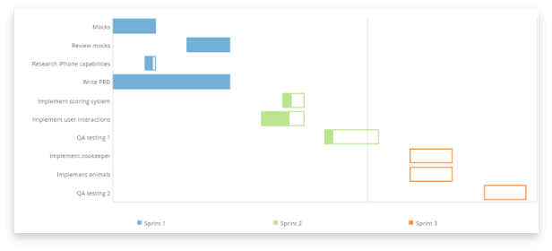
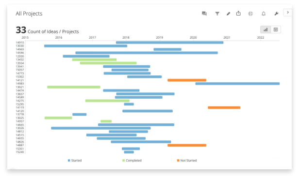
All the rage as an option for scheduling, these charts are an invaluable spin on the classic timetable. By breaking up a schedule into separate tasks and across different teams while maintaining a linear portrayal, it’s easy for everyone to understand what a project needs from start to finish, where the dependencies lie, and how long each part can take. As long as you know task deadlines and who’s doing it, you can easily put together a Gantt to track progress in a visually straightforward way. They’re brilliant at keeping people on time and tasks top-of-mind, no matter the scale of a project.
Bubble Charts – See Positive Trends & Their ‘Why’
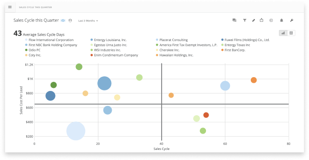
Not to be mistaken for a scatter plot, the bubble chart uses points similarly but bubbles them to varying sizes to show different data variables. While the basis is two different types of data to correlate, the third set of data determines the bubble size to illustrate how each point relates to another. They’re a solid choice for comparing data to highlight the highs and lows of complicated information, allowing decision-makers to change priorities, track performance, and more with greater ease. That said, they can be overwhelming for some if they become too cluttered, plus they’re not optimized for displaying negatives. As a tool for showcasing positive trends and the “why” of that information along the way, bubble charts are uniquely great tools.
Radar Charts – Relationships & Outliers
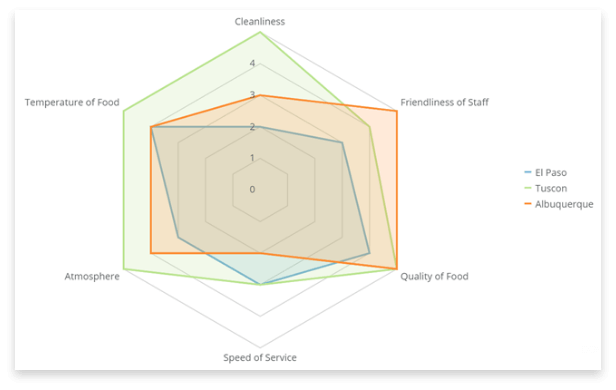
These are unique charts that approach visualization with a radial grid. There are layers of concentric circles around the fixed central point. Based on the data, they will change shape as points jump out to various levels on the scale. They become large polygons that are excellent for showing the relationship between big, broad, categorical data and calling attention to any standouts. You can make snap decisions as it’s clear where the highs and lows fall. Though they’re useful for broad comparisons, the best use is alongside other graphs and charts that can break down the data to the intricate details for a more complete story.
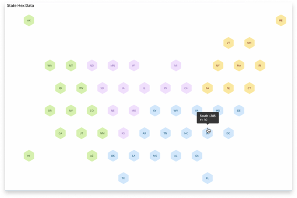
Map Charts – Regional KPIs, Distribution, so many things!
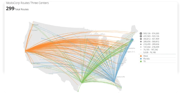
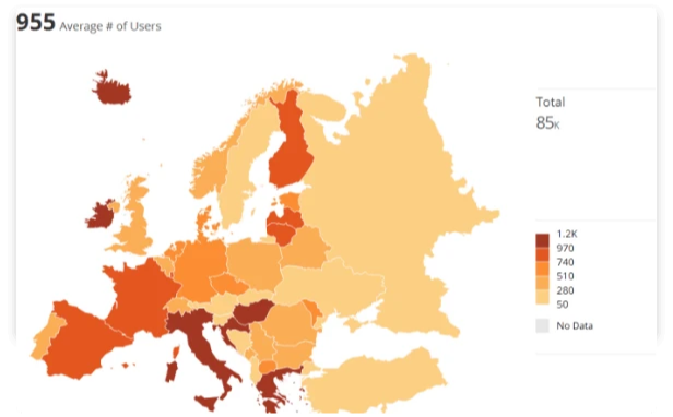
As your business spans countrywide or even internationally, turning to visualizations that can showcase your global footprint will convey helpful information to your team in moments. As long as you have a location and the data for said location, you can generate your chart to display the geographical context. They’re an excellent tool for showing regional KPIs or distribution networks at a glance without delving too deep. Since they offer such broad looks at data, they pair nicely with other charts that show subtle details best.
Taking Your Data to the Next Level
When you’re ready to put together a presentation or simply translate information in a way that better works for you, there are a few things to keep in mind. When we use Domo data visualization tools with our clients, we encourage them to first determine what they want to show and where it’s coming from. That lets you quickly track down where the necessary data is stored and how it needs to be transformed to create the required visuals. We outlined more details on this in our other blog on how to approach data visualization and factors to consider when deciding how to present your data.
Choosing the Right Data Visualization Tool
You have a lot of choices when it comes to selecting a data visualization tool. Consider prioritizing a scalable service that matches your business’s size and analytical needs. Not all systems offer the same extensive perks beyond their basic functionality. Cost is also a factor though, and you’ll definitely get what you pay for when you consider freely available toolsets. Your business might not actually need more than the free tools, which are great to leverage when you can. On the other hand, the price for more sophisticated analytical tools with a stable infrastructure and additional features, like perhaps the ability to quickly collaborate & communicate within your dashboards so everyone is on the same page, may be worth it for your decision making and team’s time.
Choosing the right tool to enhance business intelligence is a big deal, as it can carry you through some of your company’s biggest decisions with invaluable insights, driving success. Modern business is data-driven, so it’s up to you how effectively you plan to use all the information gathered at your fingertips. If you want to learn more about Domo data visualization, we have experts ready to happily talk your ear off (or just answer your questions) about the charts, stats, and figures that can elevate your decision-making.